Media Sites Are the Worst! Lessons in How Not to Design Your Self-Storage Website
The ISS editorial team views a lot of media websites while sourcing news items and other industry-related material, and the user experience is often suboptimal. In fact, some are so bad, self-storage operators can glean what not to do when designing their own facility platforms. Check out these examples, and get some helpful resources to maximize your web efforts.

To create a lot of the news content that appears on the ISS website, the editorial team winds up looking at and interacting with numerous websites each week. This is particularly true when it comes to sourcing material for our real estate and development updates. As a result, I’ve concluded that media websites are the absolute worst when it comes to user experience and can serve as useful examples for how not to design your self-storage business websites.
There are some obvious fundamental differences between the two. After all, the central focus of most media sites is written and video content, which tends to be minimized on most facility platforms. Media sites generally aren’t selling much online, while unit rentals are the primary purpose of a self-storage website. Nevertheless, the basic interactive and presentation principles at play are the same, and there are some good lessons to be learned about how not to treat and display content.
From what I can tell, there are two key problems mucking up the user experience on media websites: advertising and mobile responsiveness. Unlike self-storage websites, media sites are beholden to generating clicks for advertisers. This is out of necessity. Printed newspapers are sadly shrinking and/or disappearing with regularity, which has created an intense need for outlets to drive revenue from their online platforms.
The problem is that many media sites have become such a giant jumble of web ads, sponsored links and cross-promotional displays designed to drive the reader to other forms of content (stories or videos) that all these secondary building blocks have overrun the presentation and overpowered the entire reason for a site’s existence: delivering informative content to users!
Take a look at the sample image below. How many times have you opened a news story from a local newspaper or television station and been bombarded by web ads encroaching on the article you intended to read?
At the top of the web page are four ad positions all displaying the same advertiser, plus a pop-up banner for a different advertiser for good measure. The visual is overwhelming and detracts from why I landed on this page in the first place. If it wasn’t my job to read this particular piece of content, I may have simply closed the page and moved on to something else or found another site that offered a cleaner presentation.
The takeaway here is how not to devalue your web-page real estate. Self-storage operators aren’t pushing ads in front of eyeballs, but you might be displaying images of your facility or including blocks of related content that you want the customer to see. One key thing to keep in mind for usability is you don’t want to detract from a web page’s primary purpose.
In the example above, it’s a news story. But this could easily be a blog about something happening in your community or storage tips that you wish to convey to tenants and prospects. If you also want to include content that leads viewers to reserve a unit, view a video or read a related written piece about your property, the various elements should be presented cleanly and in an organized fashion.
Granted, one could certainly argue that this web design is organized, but to me, the visible elements de-emphasize the primary purpose of the landing page.
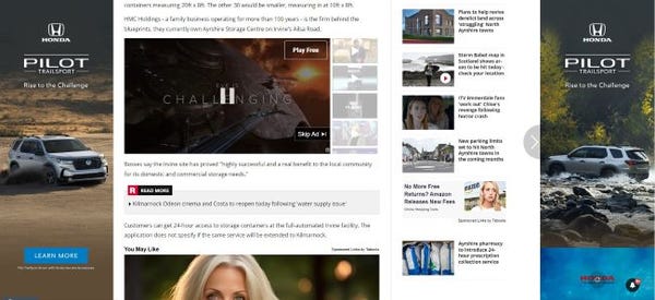
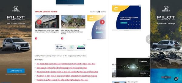
Sadly, this is actually a pretty clean delivery compared to the following example. Take a look at the two images below and try to imagine yourself reading or even finding the actual news article.


The top image is more or less the heart of the story. The second picture is the end of the same short article and contains a single line of text amongst a sea of related links, advertising and a pop-up video. It’s absolutely dizzying and completely derails the article.
I can’t stress enough how important it is not to overwhelm your viewer with a sideshow. This particular design completely encroaches on the user’s ability to view the page’s primary piece of content. While it may seem like it’s doing the advertisers a favor, the chaos of the presentation makes it difficult to focus on anything specific. If I were a paid subscriber or a dedicated reader, I certainly wouldn’t be compelled to click on any of the links, which is precisely the opposite of what this design is trying to accomplish.
In many ways, presentations like these are the byproduct of designing for a mobile audience. The images presented here are from a PC monitor, which provides more width. The style of writing in journalism and blogging is to present short paragraphs, so on a mobile phone, the lack of clarity for what is part of the editorial content is less pronounced. That said, I viewed that last example on my phone, and it was almost just as bad, including the isolated last line of the story.
Fortunately, I have yet to run across a self-storage facility website that sets off the same alarm bells. For the most part, self-storage web pages are pretty well organized without cluttering up the intent or desired message.
When evaluating your website, it’s important to interact with it and use it as if you’re a customer. What does each page look like to someone who knows nothing about your property or renting a unit? How easy is it to navigate? How cleanly do you present the most vital pieces of information you want users to know, and how well do you lead consumers from one page to another to hopefully result in a unit rental?
Here are some ISS resources to help you maximize your page design, engage your viewer and convert more leads:
About the Author(s)
You May Also Like


