World of Color: Using Self-Storage Design Aesthetics to Win Customers and Municipal Approval
The desire to place self-storage facilities in visible retail areas has coincided with an increase in building-design aesthetics. This article highlights key areas where color can be used to strengthen a facility’s appeal to consumers and city planners.
April 7, 2016
By Ariel Valli
An increase in self-storage development during the last few years has coincided with a desire to place facilities in visible retail and commercial areas favored by consumers. In addition, industry designers and operators have continued to increase property aesthetics to attract the eye and attention of potential customers and meet city requirements.
In terms of the land-use approvals necessary to build storage today, increased aesthetics are almost always required by city planners in locations that are highly visible to the public. These areas include busy arterial streets where the best retail centers are found. The use of contemporary, retail-type building materials and color is integral to achieving a high-quality design.
Color is used in a variety of ways to increase the appeal of modern self-storage. Here are six key areas where color is used and how it’s typically applied:
Walls: Relatively subtle colors can be integrated into the base design.
Roofs: Brighter colors can be introduced.
Building accents: Very bright colors can be used in limited areas.
Signage: A project’s “image colors” are incorporated here.
Roll-up doors: Bright colors are now readily available and popular.
Landscaping: The multiple subtle colors of trees, shrubs, groundcovers and flowers complement the facility design.
Let’s take a closer look at each of these components to illustrate the thought process architects and designers go through to determine the correct amount of color necessary to achieve a high-quality design that meets the test of thorough government agency review and approval.
Walls
Walls are normally the greatest challenge facing architects. Self-storage projects are known for the large linear and sometimes tall wall planes necessary to enclose the units. Long, plain, undecorated walls simply aren’t acceptable to the agencies, boards and commissions charged with approving these projects. Articulation must be added in the form of variable wall heights, horizontal offsets and architectural details.
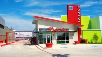 Color can be used to provide additional interest, but its use must be subtle. Most self-storage walls are concrete, concrete block or steel framing. These materials can be finished in a variety of ways including simple paint, a stucco-type finish, or standard or insulated steel panels. Concrete, concrete block and stucco are considered “natural” materials and don’t lend themselves to bright colors. Earth or grey tones work best.
Bright colors can be introduced on wall planes by using smooth or corrugated metals, but these areas must be relatively small to avoid coming off as overbearing. The growing challenge for architects is to get agency approval for larger and brighter metal-wall surfaces. Popular colors include metallic copper, silver and bronze, and just about every shade of bright color imaginable, including primary colors like red, blue and yellow. Obtaining approval for these eye-catching elements isn’t an easy task, but this type of retail look is preferred by the vast majority of storage developers today.
Roofs
Roofs provide a great opportunity to use color. Although most self-storage roofs are flat due to the large size of the buildings, some of the most visible areas can be articulated by adding towers to emphasize a vertical element. These can then be covered with a sloping roof surface. Options include flat or curved tiles, which are generally considered earth materials and must be a subtle, natural color. Again, colorful metals provide a great opportunity for visual impact.
Building Accents
Detailed building accents include the many small elements architects add to the basic structure to add depth and visual interest. These include window awnings, cornices at the tops of walls, vertical trim at building corners, trim on windows and doors, roof edges, wall trellises for vines, and small, projecting wall-plane offsets, which can be horizontal or vertical. These elements are normally surface-applied foam products, steel stud-framed wall projections or, in some climates, surface-applied wood trim.
The small nature of these components allows them to be finished in more intense colors than the subtle base color of adjacent walls. Again, detail elements made of earth materials don’t accommodate bright colors; however, metals are commonly used for awnings, roof edges, trellises and accent-projecting wall planes. These components are readily adaptable to the more powerful colors that catch the eye.
Signage
Signage always brings color to a project. The Public Storage orange and Extra Space Storage green are perfect examples of color branding by major operators. Naturally, these bright hues are prominently featured on their wall signage and ground-monument signs. Bright illumination on these signs further intensifies the impact. Signage colors should be complementary to the accent colors incorporated into building features.
Roll-Up Doors
Roll-up doors have long been known to be the “face” of self-storage, and these components are very popular for the product identification facilities need. Colorful doors can be standard, exposed on the exterior of the building. They can also be upper-floor hallway, visible through glass. They can even be false, surface-mounted in key visible areas facing the street.
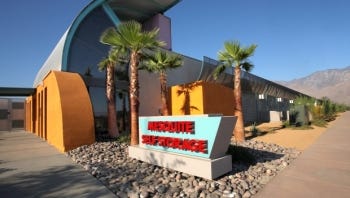 Industry door vendors offer a variety of bright, standard factory colors such as yellow, orange, red and various shades of green. Since many jurisdictions specifically prohibit the view of roll-up doors from the street, designers must integrate these components seamlessly into the design concept. City planners won’t approve door elements that are thoughtlessly designed or randomly placed, as these appear to be an afterthought and not a well-integrated feature.
Landscaping
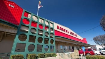 Landscaping brings the finishing touches to a storage project. Trees are always a popular element, and they come in every shade of green imaginable. During the autumn months, the red, gold and yellow of changing leaves can be very attractive if carefully integrated to the project design. In warmer climates, bright flowering shrubs and wall vines can add much visual appeal, even over large areas. Lastly, a well-positioned grouping of colorful groundcover or flowers near the office entry can brighten any color scheme.
The trend toward better-articulated self-storage buildings that are sleek and contemporary in nature is expected to endure. Retail-oriented, bright and cheerful colors are and will continue to be essential to this style. New projects entering the design process today are being conceptualized to win land-use entitlement battles with city planners, especially in the urban and suburban locations preferred by developers and the public they serve. The proper use of color can help them win.
Ariel L. Valli is president and principal architect of Valli Architectural Group, which was founded in 1997 to provide specialized design services to the self-storage industry. Over the course of a 33-year career, Mr. Valli has been involved in 500 completed self-storage projects, primarily in the Southwest. Completed projects include numerous award-winners. For more information, call 949.349.1777; visit www.valliarch.com.
You May Also Like


