Creating graphics to use in your self-storage marketing may feel a bit outside your wheelhouse, but you don’t have to be a trained artist to produce effective business visuals. These tips will help you conceptualize and design graphics to strengthen your brand messaging.
The process of creating effective graphics to use in your self-storage marketing can feel overwhelming, even if you have some design training, which the average facility operator doesn’t. The following guidance will help you craft your own artwork or better critique visuals made by a vendor partner. Leverage these tips to conceptualize and design your own graphics for signage, advertising, printed collateral and more.
Getting Started
A picture may be worth a thousand words, but it’s how you use it that makes or breaks the effectiveness of a marketing graphic on its intended audience. At the start of your artistic journey, it’s smart to establish your intentions, such as finding the perfect balance between text and pictures to ensure your self-storage brand message is received loud and clear, without any room for misinterpretation.
In other words, before you begin building a self-storage graphic, define the goal behind it. Ask yourself these questions:
What is the reason for this graphic?
What do I want it to say to current and potential customers?
How might this graphic be interpreted?
Your answers should be straightforward and specific. If you’re unable to clearly define your purpose, you aren’t ready to begin.
Choosing Images
Most people appreciate photos of cute animals and sunsets, but who pays attention to images of storage-unit doors? Almost no one. Still, as a facility operator, your first concern should be that any marketing images you use are a clear, positive representation of your company. Choose ones that’ll draw the attention of your intended audience: someone in the market for self-storage.
Any image you use should have two key ingredients: a focal point and a message. A focal point tells the viewer where to look. Your image should tell a story, and the focal point should be front and center. If it isn’t obvious, you can make it more so through blocking techniques, masks or gradients, even blurring out elements you don’t want to distract the viewer. Everything else you include in the graphic, such as text, is an additive.
For instance, look at the following graphic of someone holding a credit card in front of an open laptop. The person is out of focus, so your eyes are naturally drawn to the hand. The inferred meaning of the image, without any need for copy, has something to do with making a purchase or submitting a payment. It tells the viewer that a monetary transaction is about to occur or has just been made.

Adding Text
The above example doesn’t need words to convey a message, however, you could add text to further elaborate and enforce your marketing goals. Something like “Pay online anytime!” or “Set up Autopay today!” could be ideal, depending on the intent of the graphic, and support the overall visual effect.
While the words you include are important, knowing where to place them is essential for maximum impact. Think about what what’ll enhance or define the message, and then consider where the words should appear. Keep in mind that adding text impacts the viewer in two ways: First, it keeps their attention on the graphic longer, since it must be read; second, it’s your opportunity to engage them.
That said, if you include a paragraph of text under a photo, nines times out of 10 it’ll be ignored unless the image is strong enough to draw the viewer in and the text block gets them curious, intrigued or even annoyed enough that they simply must investigate. Remember, though, the primary goal is to create an engaging graphic without irritating prospective self-storage customers.
When considering copy to accompany an image, first say what you want to say, and then restate it as though you’re talking to a child. Keeping things simple is the best way to get your message across without any misinterpretation. Consider this graphic containing a unit door, for example:

The background directly relates to self-storage and is easily identifiable. Next, we add our copy. In this example, we’re simply using the business name. Since it’s on a blurred background, it’s front and center and immediately becomes the focal point. Suggested uses for this type of image in self-storage are to convey branding, or something related to sales, discounts, policy changes or amenities.
Another copy strategy is to use complete thoughts, phrases, sentences or quotes. The aim is to have the image draw the viewer’s attention and then provide additional details. Keep the message simple, straightforward and direct. Less in more when adding text to images.
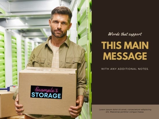
For example, take a look at the following graphic of a man holding a box. It contains some of the visual elements we’ve discussed, along with a simple, clear, written message. Your eye is drawn in two directions. Most people will first see “This Main Message” on the right-hand side followed by the company name on the box. This tells you who and what, with additional room for where, when and how.

Here’s another similar graphic. See how easy it is to change up similar elements for a very different visual effect?

Graphic Size and Elements
Once you’ve created your graphic or concept, you need to be able to adjust its size to fit the platforms on which it’ll be seen. Every channel has an ideal image size. This is true whether we’re talking about social media, business cards or even outdoor billboards. We’ve all seen billboards that simply can’t be read while driving down the interstate at 70 mph. Don’t throw away your money or time. Make the extra effort to plan out your designs, and then test each size to ensure it works for proper placement and fluidity of the elements included.
Following are some general tips to help you pick the graphic elements that’ll work best for your intended application. These can be used on almost any graphic to strengthen your self-storage message and design.
Illustrations. Cartoons, drawings and even animations are often used to convey a friendly, approachable attitude. These are a great way to discuss facility dos and don’ts as well as self-storage policies and procedures.
Headshots. Be very careful when using stock photography, especially headshots. A person’s face can quickly become part of your brand identity. Headshots should really only be used when they belong to a specific person within your company.
Aerials. Drone footage has become increasingly popular in self-storage marketing and is an ideal way to show your facility size and location. However, it can also highlight areas of concern for customers or needed improvements. Use aerial images with caution, and always crop out anything that doesn’t belong to your property. You don’t want to give the business next door free advertising on your dime.
Property images. Visuals that show off your self-storage facility are highly recommended—if they’re good quality. Don’t use a photo if it’s grainy, out of focus or shows a problem area. Use these images to tell the story of your business while allowing customers to get a feel for your site. No one wants to see something on the internet only to show up and be disappointed by reality.
When building your self-storage marketing graphics, have a reason for choosing particular images, and use words only when necessary to convey a complete concept. As long as you scale your graphic according to its intended platform and are always mindful of the unspoken meaning behind the visuals you create, you’ll be able to effectively use your artwork to strengthen your brand messaging.
Mohala Johnson is the director of web technology for Tellus Development Ltd., a real estate and development firm that operates more than 30 self-storage facilities in the Southeast. With more than 10 years of management and customer-service experience, she handles the company’s digital and print marketing. Writing has always been a passion of hers, and she’s excited to share her knowledge with the self-storage industry. Connect with her at www.linkedin.com/in/mohalajohnson.
About the Author(s)
You May Also Like


